CASE STUDY / 02DENISE LEONOR ORTIZ
PERSONAL REAL ESTATE BRANDA PERSONAL BRAND WITH A PRODUCTION-GRADE WEBSITE BEHIND IT.
Brand translation, custom development, responsive design, domain migration, hosting, analytics, visual content, QA, and launch support.
VISIT LIVE SITE →CHICAGO / 2026
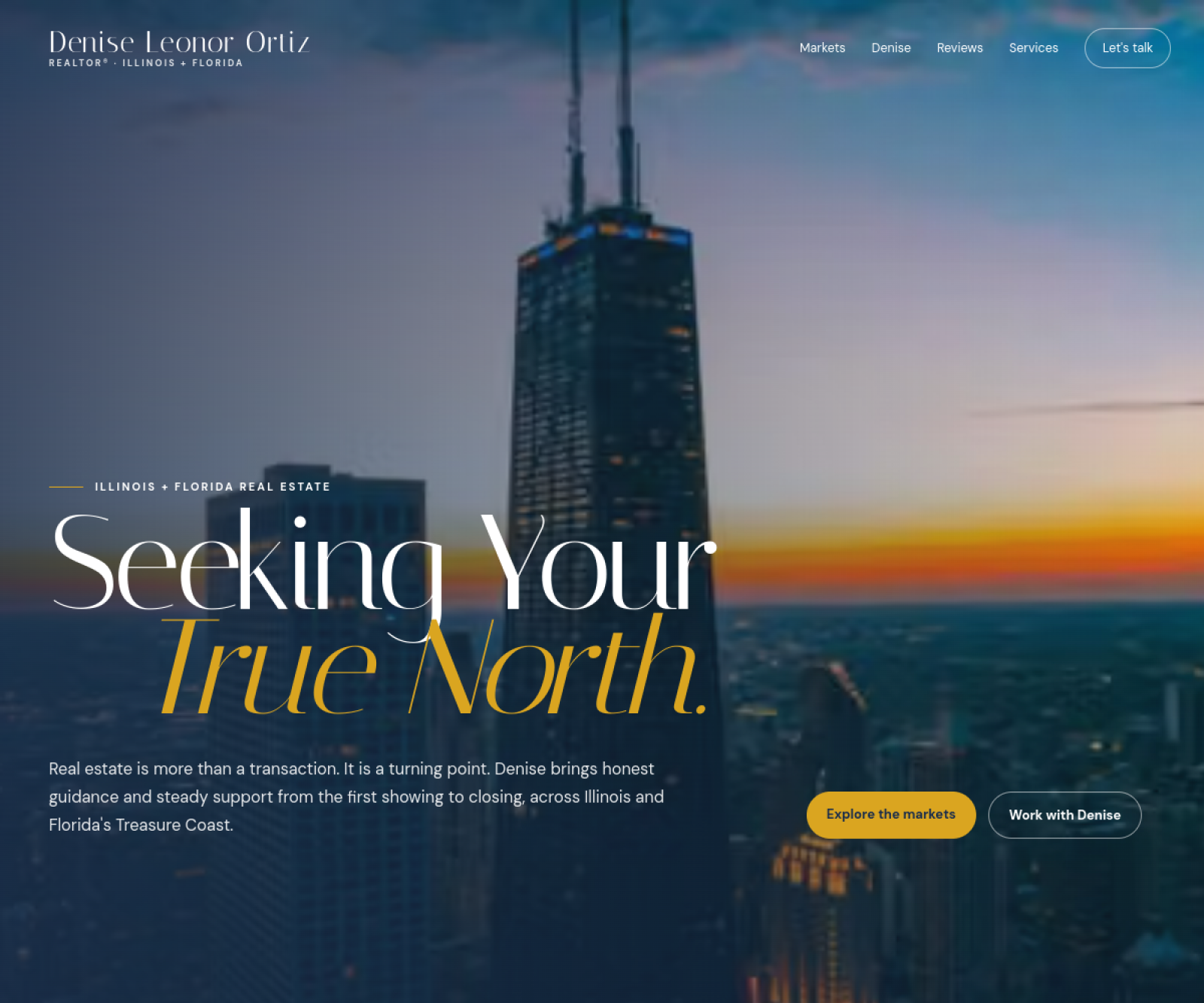
DESKTOP + MOBILE
PROJECT SNAPSHOT
What the engagement actually covered.
01Custom website build
02Personal brand translation
03Responsive mobile experience
04Live domain migration
05Production deployment
06Analytics integration
07Visual content system
08Launch QA + support
We preserved the distinct visual identity and messaging, then built the site structure, responsive behavior, domain migration, analytics, and production launch around it so the personality and the technical delivery worked together.
WHAT CHANGED
The work, translated into visible improvements.
The brand became a complete web experience
Identity, messaging, imagery, navigation, and calls to action were brought into one consistent system instead of appearing as separate pieces.
The site stayed personal on mobile
The responsive experience protects the same tone, hierarchy, and visual identity when the layout collapses to a phone.
Content gained clearer structure
Real-estate information and supporting content were organized so visitors can explore without losing the personal feel of the brand.
The live domain moved onto a modern production stack
Migration, HTTPS, analytics, deployment, and launch QA were handled as part of the release.
TECHNICAL DELIVERY
The parts visitors do not see still matter.
LIVE DOMAINProduction migration completed
HTTPSSecure deployment configured
ANALYTICSVisitor behavior measurable
RESPONSIVE QADesktop and mobile checks
VISUAL SYSTEMBrand and photography integrated
LAUNCH SUPPORTProduction fixes and refinement
BUILT TO REPRESENT HER
BACK TO WORK →Professional enough for the business. Personal enough to still feel like Denise.
That balance is the point of the project.